HW Readings |
Data sets |
|
Intro to Data - print, read, highlight/annotate and answer Q 1.2 and 1.3
Read this link of standard deviation. Data Dredging - read, take notes or outline. Stats/Nature of Science Readings Stats Average Stats Std Deviation vs MAD Stats Ritual Stats Significance The New Yorker Articles (and other sources) Salmonella should scare the crap out of you! Resources for UnitsLearning Excel - go here
Interactive Graphs and whatnot TABLEAU Intro to Tableau Measures of Central Tendency Distributions What is Central Tendency Balancing activity Guided lesson on mean, median and mode Learning R Go here: Datacamp R CHEAT SHEET Create an account and start enroll in Intro to R Graphing in R: Sites for Infographics Informationisbeautiful.com https://marketplace.visual.ly/infographics http://piktochart.com/ Optimization Optimization instructions Bathing Friends file Optimization problems Use Optima for Animals pg 18, 70, 85 - Use solver for Moose data K-Means Clustering Excel Wine Data Clustering Instructions Network Analysis Network graphs with Fusion Tables Further explanation Even further explanation H Band Class template B Band Class Template ...And the results Linear Regression Intro to Correlation and Regression Spurious Correlations Assumptions of Regression 1st Data set - Lions, black noses and ages 2nd Data set - Face width and penalty minutes **How to make sense of the 2nd data set 3rd dataset - Iron and Phytoplankton growth First lesson on Regression in Excel BEST EXPLANATION OF CORRELATION VS. REGRESSION Experimental Design PowerPointExperimental design project guidelinesDesign an experiment
1. Research the topic. 2. Design your experimental protocol by considering the following:
Mini data projectUsing the included Motor Trend cars dataset calculate the following:
Infographics activity1. Scour the web for 2 excellent data visualizations/infographics.
For each write a short paragraph to answer each of the following questions: - Why did you pick this visualization? - Explain the data that is displays. How many axes are shown? How many data points? (Estimate this) Are there any summary stats shown, and if so which ones? - What makes it good? How does it accomplish something more than displaying numbers... - How could it be improved? |
Geyser data Baseball salary data, instructions click here Dissolved oxygen data, instructions click here Cigarette data Tufte Dataset Data for histogram Good histogram data Practice data sets ed spending - best graph choice deaths from tigers - best graph choice salmon length and mass - best choice to demonstrate relationship sea anemone startle response times:
Confidence Intervals and T-tests Blackbird Beer and mosquitoes Weddell seals Rat reciprocity T test Mini Project PairedData descriptions Anorexia data Blink ChickWeight Corn Grapefruit Horses BloodLead Google Fusion Tables Baseball data Instructions for Activity Tableau datasets Population by County Quiz data for 10/3/14Graphing Test doc
*** Immediately save as FirstLast_DataGraphingQuiz Q2 - Endangered species Q3 - Spermatophore masses Q4 - Fruits and photosynthesis Q5 - Hurricanes Quiz data for 12/12/14Data Analysis in Practice
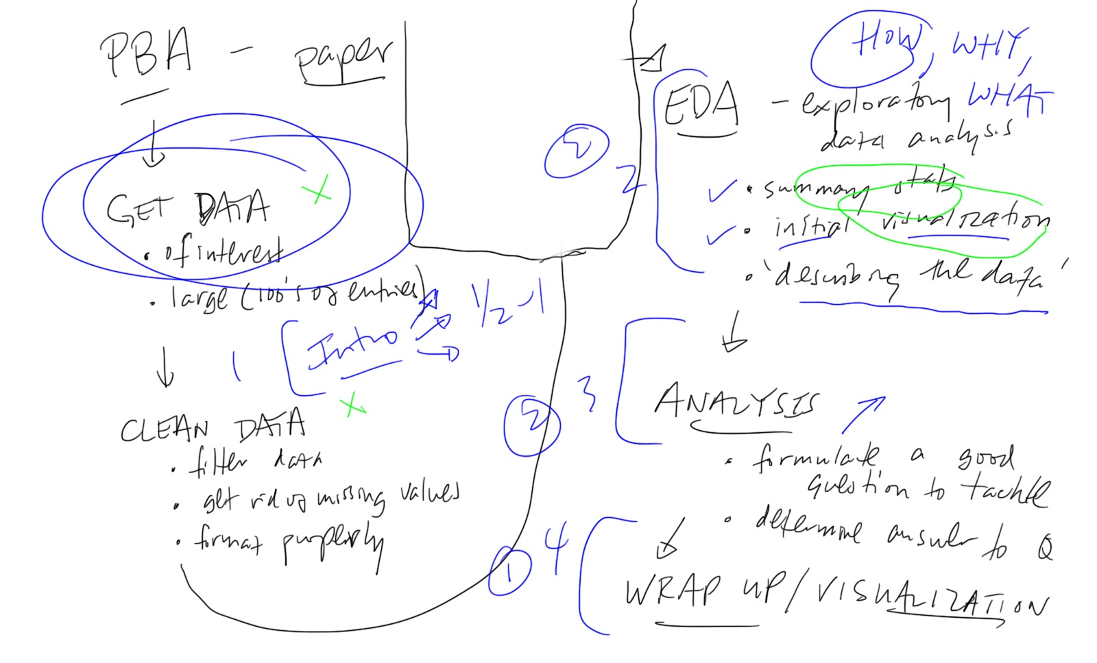
PBA stuffThe flowchart from class
Old Rubric outline:
New PBA Data Project Tasks
Miscellaneous resources |
